
The Best Design Things I Read in 2015
A small collection of articles that stuck out in my mind this year.
How to Design for Everybody
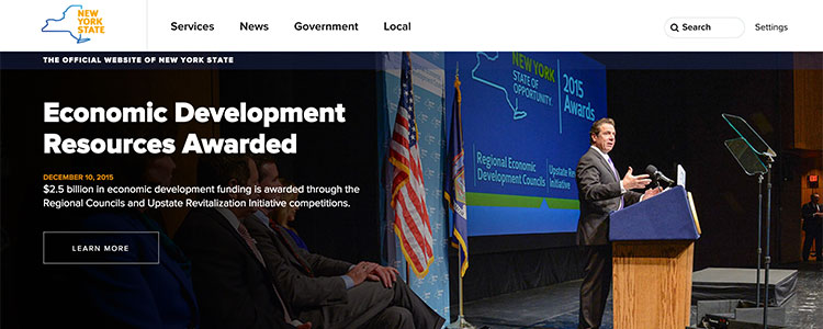
Solid, bite-sized nuggets of design advice from a government website redesign. I particularly enjoyed the section Your org chart is not your information architecture since it’s rarely how folks outside an organization think. Also true in the private sector.
Never Ask What They Want
“If you jump to asking users about how they think something can be better from the start, you only get their opinion, not how they actually deal with their current problem.”
Users are best at explaining their goals and workflow tendencies. Don’t just build whatever people say they want.

16 product things I learned at Imgur
I did not expect this level of mature product thinking from a site about GIFs. This short listicle caught me off guard in the best possible way.

The Only Competitor That Matters
The clichéd piece of advice to “ignore your competitors” makes a good sound byte, but it’s not too practical for those who work in a small, competitive spaces. This article talks about what to look for when watching the competition. Complete with Mario Kart reference!
Product Design Debt Versus Technical Debt
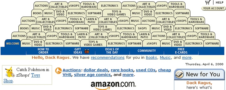
At a certain point, a design might stop catering to new features being piled on. This year, a few of my designs reached this point. Articles like this helped me realize when it’s time to modify or consolidate a design in the face of new content.
“Each incremental menu item is not a big deal, and provides a lot of value downstream, but a slight incremental cost. But do this enough times, and you’ll start to pollute the overall design aesthetic, which is a public good that all features share.”
Before You Plan Your Next Product Roadmap
“Are all your users using all the features in your product? Of course they’re not. Let’s talk about that.”
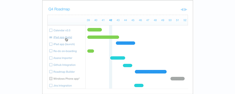
Project roadmaps don’t just involve building new things. Intercom offers advice on auditing parts of a project, picking out things that folks don’t use much, and reconsidering their utility.
The High Price of the Wrong Solution
“Here were founders who had defined a real, tangible problem. But their solution went after it piecemeal. Every time they discovered something new — a different facet to the problem, a different audience — they added a new feature to address it. The result is what felt like a very complex, brittle product that will never fully solve the problem.”
Sound familiar? It does to me. A nice, short read on product design definition.
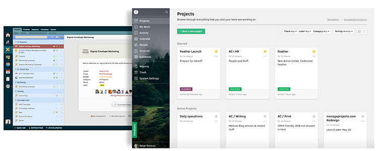
Redesigning Active Collab
Along same lines as the above, this case study details how designers reduced and streamlined a product that had lost its way. I thoroughly enjoyed the section titled The problem of too much functionality.
“It’s much easier to add features and create an illusion that the software is powerful than to actually invest effort, understand the needs of real users, and develop the product accordingly.”

Not Every Product Needs to Be Beautiful
Due to time and resource constraints, I’m often unable to revisit projects to polish visuals or refactor code. Although most every product or site is usable, I’m often nagged by the feeling that I hadn’t given it my all. Appears I’m not alone.

Getting from ‘Why Should I?’ to ‘Why Not?’
Stakeholders achieve their goals through careful planning and execution while minimizing change and risk. To them, I am a threat. This article helped me step into their shoes and think about how to sell my work (which is as important as creating it).
Supporting People
Whenever I find myself complaining about old browsers / email clients, I re-read this. Helps put things in perspective.

Phantom Burnout
Tinkering. Lack of focus. Feeling worn down and tired. Being frequently and easily distracted. I’ve been going through small bouts with phantom burnout for a year or two. It’s never obvious when it shows up, so I’m always watching out for it.
How to Email with an Old Friend After Falling Out of Touch
Without small talk or awkward moments.
Also published at https://medium.com/@tedgoas/the-best-design-things-i-read-in-2015-95c54edb11dc#.qh08vhi0q
