
Design Matters ’17
I attended Design Matters with a few of my coworkers at Stack Overflow. It was my first time attending the conference and visiting Denmark. It was a wonderful few days of learning about failure, improving design communication, and taking in the city of Copenhagen.
Here are my notes from a few talks I attended.
The End is the Beginning by Rahul Sen, Spotify
“I have not failed. I’ve just found 10,000 ways that won’t work.”
Rahul Sen kicked off the conference by talking about how it’s ok, even good, to fail as a designer. This was one of the main themes at Design Matters ’17 and something many of the speakers touched on. Failing is a good thing when you learn from it.
“Be confused… but at a higher level.”
Rahul argued that failure is a core design muscle, that making new mistakes and failing at new things helps our designs to evolve. Thoughtful design isn’t afraid to be wrong.
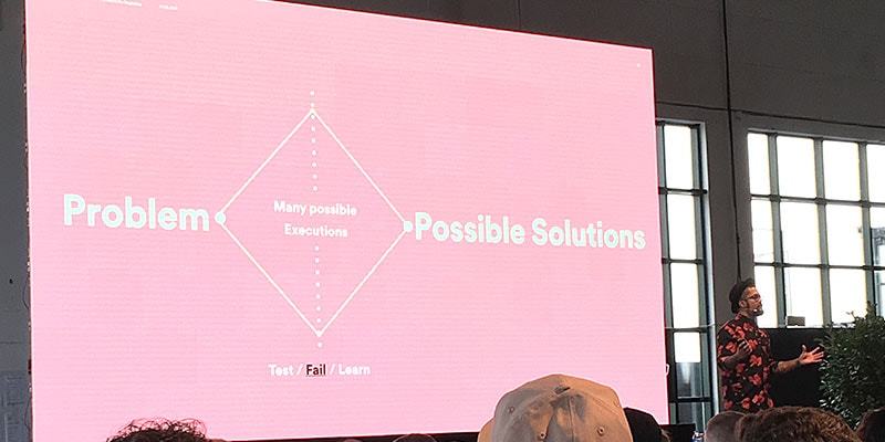
his was a great way to open the conference. Hearing this helped put me at ease.
Applying Vonnegut’s 8 Rules for Writing for User Experience by Hazel Jennings, Instagram
Hazel Jennings talked about writing in product and interface design. She focused not only on language and tone, but on context and timing also. For example, when Instagram adds a new feature, the in-app messaging is designed in a way that doesn’t interrupt someone while they’re taking a picture. Hazel reminded us not to force people to use a product how WE want them to, but allow them use it how THEY want to.
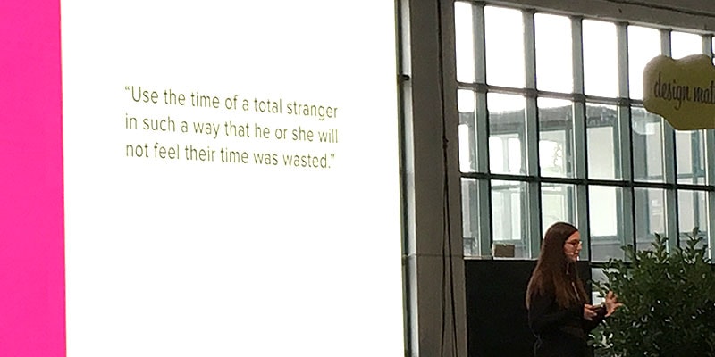
Hazel also touched on the idea that “Nobody reads,” which she says is not objectively true.
“Nobody reads terrible, unuseful content, so make it good!”
She suggested writing to please just one person, using personalization whenever possible, even if it’s early in the process. For example, when someone signs up for Instagram, the app lists recommended accounts to follow. For a while, every new user saw the same list. However, Instagram started asking a few basic questions about their interests and friends on other social networks after signup, so the list of recommended Instagram accounts became personalized, even for someone who signed up seconds ago.
Building Flexible Design Systems by Yesenia Perez, Vox Media
Yesenia Perez talked about building Vox Media’s design system and the decisions they made. I was particularly interested in this topic, as it’s something we’re thinking about at Stack Overflow.
Vox created a design system for their suite of 8 brands and 350+ sites. The team started the project by thinking of a design system being made up of atomic components, or legos, that can be combined to make just about anything. It’s a popular analogy for design systems, though Vox has 8 brands that serve very different types of content to very different audiences. For Vox, simply switching up fonts and color wasn’t enough. The “lego” approach led to sites that looked too similar to one another.
“Be scenario-driven when creating variations in a design system.”
Ultimately Yesenia’s team landed on something she referred to as scenario-driven design. Where scenarios, not layout, drive variation in a design system. This means no hypothetical situations when auditing components and deciding when to make variations. At Vox, not all products use every component in the Vox design system. If a product needs a pattern, only then do they build it.
I feel like this approach would speed things up for anyone working on a design system. This was a major takeaway for me.
Communicating Designs that Appeal to the Business by Brent Palmer, Zendesk
Brent Palmer talked about how to talk about design to non-designers. It’s a hard and often-overlooked skill. He argues that how you communicate design may be more important than the design itself.
He used ZenDesk as an example. They had a hard time explaining their 2016 rebrand to their own people. They couldn’t see the value.
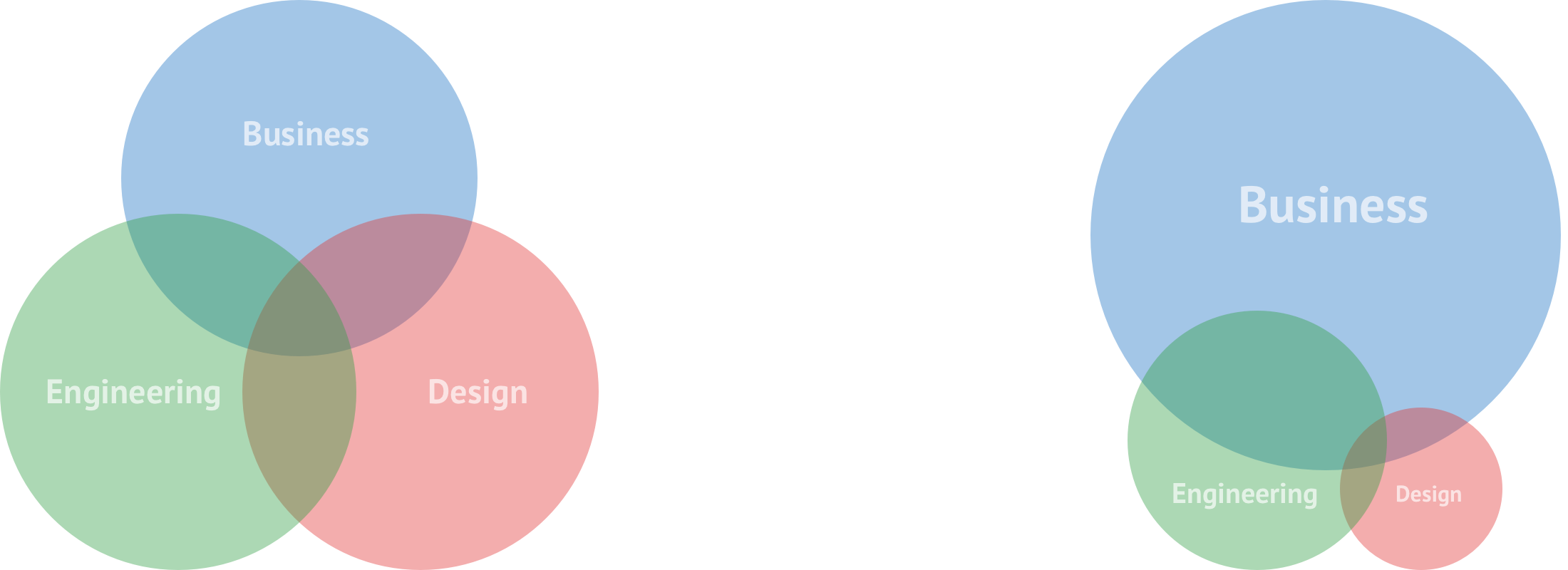
To convince someone to change something you must appeal to reason and intuition.
“Compelling stories without data or data without a compelling story - that’s how bad things get built” - @brentpalmer #DesignMatters17
— Piper Lawson (@UxPiper) September 28, 2017
When approaching design problems, ZenDesk starts with data analysis (get revenue data from finance if you can!). If they find an anomaly, UX research chases it down and design creates a testable prototype.
When they have an design proposal to announce internally, ZenDesk creates highlight reel videos instead of lengthy emails or slide decks. Brent explained how people actually watched and engaged with product updates this way, which helped create a shared understanding of a design’s value to the company.
A Story of Transformation by Katy Tsai & Maria Iu, LinkedIn
Katy and Mary started by talking about design debt. Historically, LinkedIn added a new section every time a new team was formed. Each of these sections used a dated design aesthetic and was built on its own tech stack. The site didn’t share code across different parts of the product. LinkedIn’s team needed to fix things that fell by the wayside during the company’s hyper-growth. They needed a unified redesign across their fragmented products.
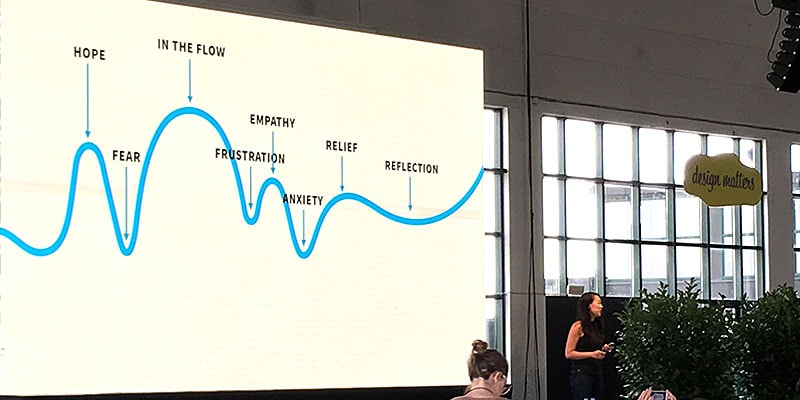
LinkedIn started by creating a war room. 42 teams contributed, everything from SRE to Legal, all involved from the start. “How would you handle onboarding?” “How should we verify email?” Having so many different people in the room led to interesting conversations. The war room’s space was used to review competitors and sketch ideas. The walls were covered with design concepts.
LinkedIn designed mobile-first, extending their newly created design system outwards on desktop. Color, buttons, charts, tables, typography; everything had a decision maker so they didn’t debate endlessly. This helped get designs out the door, where the team continues to fix and iterate.
This was another big takeaway for me: a design system should be treated as a real product, with leadership and timelines. Even if it’s not part of a redesign.
Feature, Not a Bug by Amy Roberts, Google Chrome
A lot of people don’t realize Chrome is a designed experience. It’s both loved and completely invisible. Amy Roberts talked about how Chrome’s design team builds invisible trust between Chrome and its users.
Get out of the way. Tiny things that don’t seem to bad multiply. It creates anxiety that you can’t feel anymore, but the tension compounds over time.
Stay out of the way. Be consistent, not uniform. (Eg. don’t follow Android design patterns on iOS). It’s the difference between being an app and being a platform. Questioning failure when it doesn’t work is hard. Questioning success can be even harder.
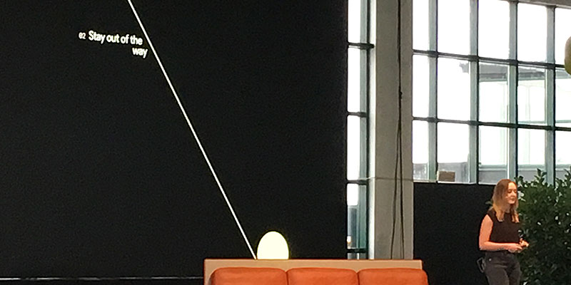
Dinosaur. This is the fun thing you add after you’ve taken everything else away. It’s the thing you can’t advertise cause you have to stay out of the way. This is the the sort of thing that separates a delightful experience from a useable one. Dinosaur moments are rare, inclusive, and only work if the rest of the context does too. Examples of when NOT to use a dinosaur are in error states, with sensitive information, or in workflows where they might appear often.
Learning from Failure to be a Better Designer by Sam Horner, Netflix
Sam defined failure is “the omission of the expected outcome.” It’s not about if you fail or how you fail, it’s about how you deal with it.
“Freedom to fail but responsibility to learn from them.”
Netflix has no design process and designers are almost encouraged to seek failure.
“What should I watch on Netflix?”
Sam used this age-old question as an example of how Netflix learned from a mistake. Years ago, Netflix built a chat UI to help folks find stuff to watch on Netflix. It didn’t test well, but when looking at the data gained from the project, they learned that the idea they were attempting to solve was a good one. The chat UI just wasn’t doing a good job. They updated the UI to collect even more information, then transformed their chat UI into a Tinder-like app to gather preferences quickly. This achieved their original goal of gathering data, despite failing as a launch able product. Even though the product failed, the team succeeded.
They used this data to build Netflix’s current UI, which allows users to view trailers and browse at the same time, gets users excited about upcoming releases, and more.
- Be proud of what you learn, not what you build. Products die, learnings never do.
- Don’t take it personal. It won’t be easy, so get up and use what you learned on the next project.
- Fear of failure is not a good enough reason not to try. Keep with it, even if you don’t see the fruits of your labor right away.
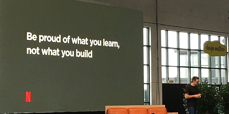
Netflix fails tests every day, and that’s ok as long as it leads to better products in the long run.
Copenhagen
When not at the conference, we explored what Danish culture has to offer. We biked around the city, explored a few museums, and partook in smorgasbord. Copenhagen is a great town in which to spend a few days.


Wrapping Up
It was eye-opening to hear so many stories of project failures. I think Stack Overflow has a pretty good culture regarding failure, but after hearing folks talk about their own failures, I’m going to revisit some of ours to see if there’s anything else we can take away from them before moving forward.
Thanks to the organizers, speakers, and attendees for making Design Matters such an amazing experience! 🇩🇰
Also published on Medium
