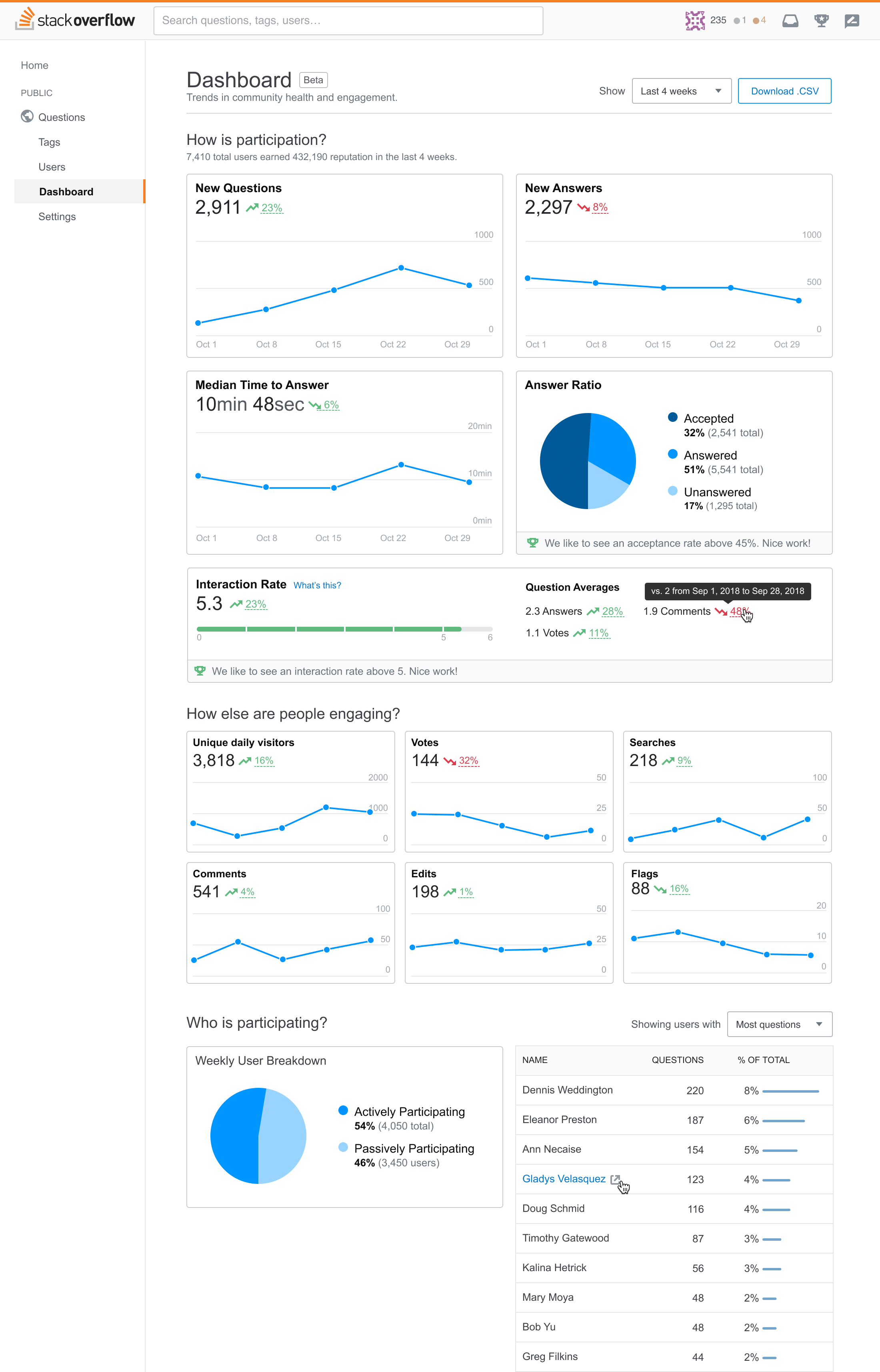
Community Health Dashboard
I led the discovery and design of a dashboard that helps clients see the return on their investment while reducing customer support overhead.
At Stack Overflow, we work with our Enterprise clients to manage their own private Stack Overflow community. But understanding a community’s metrics wasn’t always easy.
Our theory was that if clients can easily see the return on their investment, they’re likely to continue using our product. Our product didn’t give them a way to do this, so the goal was to give clients a way to monitor and proactively improve the health of their community. Clients that can solve their own problems have a good chance to renewing and growing.
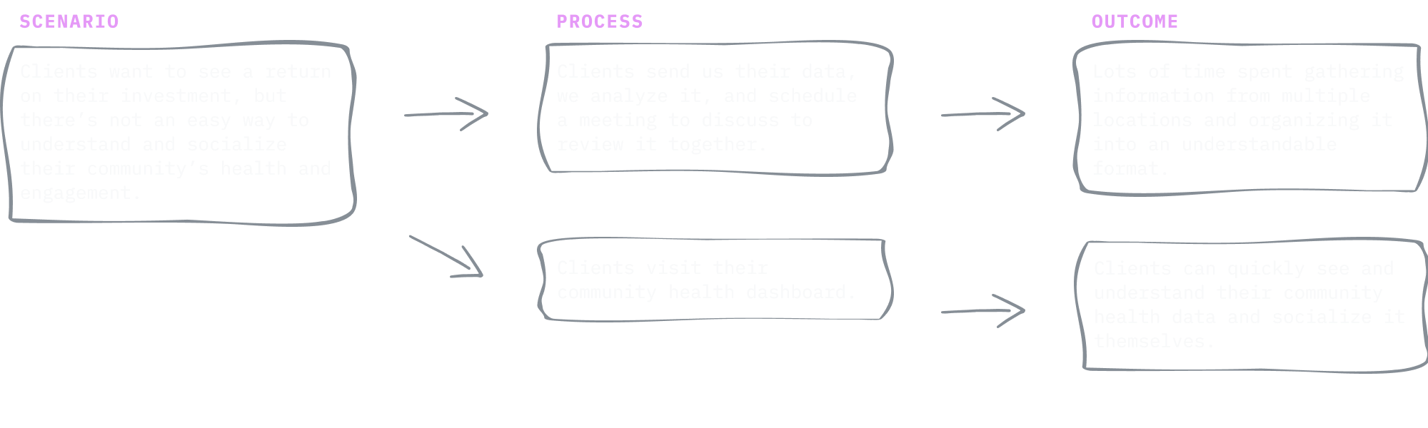
Our dashboard should take the same situation and creates a different output.
Planning my approach
As an Enterprise admin, I want to have a good handle on how I’m doing and easily be able to measure ROI of Enterprise so that I’m aware of my community’s strengths and weaknesses. - Our user story
First I wanted to understand what we already know, so I interviewed the members of our customer success team to learn about how we work with clients on their community health. I learned that clients would email us numbers from an admin screen, we’d analyze it, and schedule a meeting to review it together.
What a manual, time-consuming process!
After speaking with Customer Success Managers and Engineers, I understood what metrics we use to track community health and learned where clients struggle most when it comes to understanding their data.
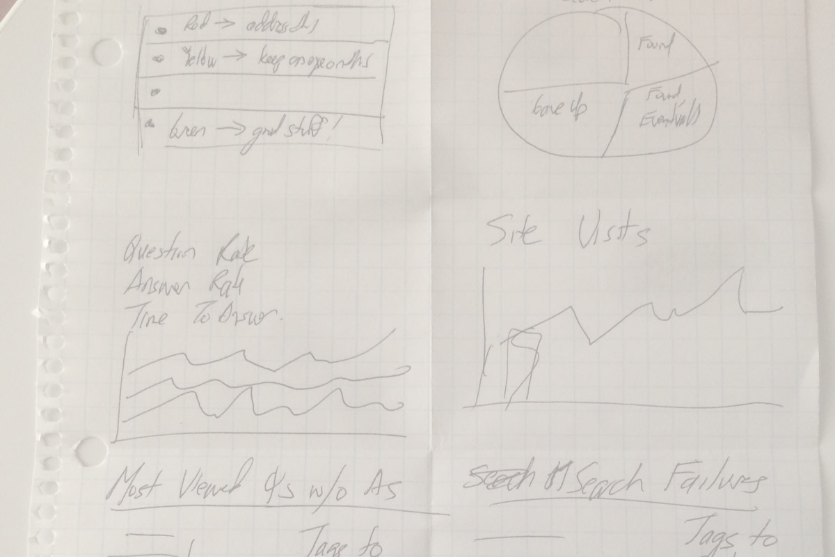
I figured this project would be complex, so I organized and led a series of How Might We sketching sessions with the Enterprise developers, product managers, site reliability engineers, and even our general manager. Open collaboration like this invited new and different perspectives.
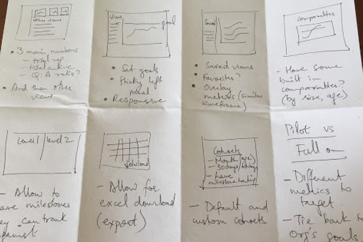
Armed with these ideas, I created several wireframes for the reporting dashboard. I wanted to know if the designs showed the right information in an understandable way. I started shopping this around to my product design, in design critique, and most importantly, a few customers. Lo-fi wireframes allowed me to iterate quickly but still gave me something visual to show folks and guide a conversation. Our clients were very excited to see we were working on this. 🤗
We made a few updates based on feedback and started a functional spec that details how the design should work minute detail.
I worked closely with my product manager and developers throughout the discovery process. I helped write a functional spec and kept it updated with research findings, notable conversations, and updated designs so it continued to be a single source of truth throughout the project.
I’d been sharing my progress in cross team meetings to socialize the project and get feedback. At one point, another product team expressed interest in using it for their own product, so we planned the design and build to be reusable outside of our Enterprise product.
Being practical while innovating
By now our direction was well validated, so I moved into UI design. Another designer had recently created a few data visualizations for a different project, so I used her aesthetic as a starting point for the dashboard UI and evolved it to suit our needs. I also did a few UX teardowns and even searched dribbble to get an idea of how other folks are visualizing data like ours.
Sidenote: Say what you will about “fake work” on dribbble, I find it incredibly useful.
As I designed, I wanted to ensure we were presenting the data appropriately and anticipate edge cases, so I ping’d one of our data scientists before we became invested in the design. She helped review my data visualization choices and raised a concern about zooming into the data too closely (something I didn’t previously have on my radar). After all, we were building something to show trends over time, not granular analytics. Based on this feedback, we opted not to provide the ability to break down data beyond a certain point (even though we technically could).
Guiding implementation
While I worked on the UI design, an engineer laid the code foundation based on the functional spec. We checked in with each other every other day or so, updating the spec with any notable conversations we had.

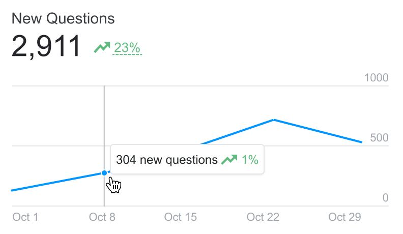
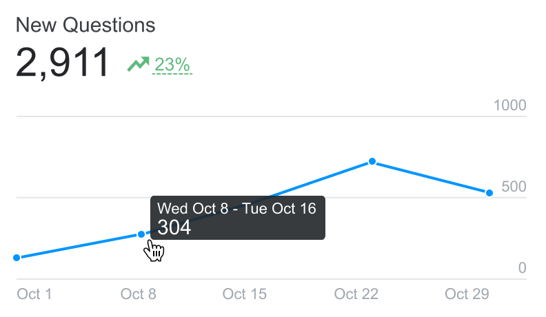
After I’d designed most of the design’s views and states, I jumped into the codebase and translated my designs into front-end code. I made some last mile decisions in code, like responsive views and adjusting the graphs’ appearance in D3.
Our design system really helped with front-end patterns and UX copy. I even contributed some work for cards back into the design system based on what we created for the dashboard.
A few times the project started veering towards in an in-depth analytics product. Whenever I saw this happening, I gently reminded the team that our north star was to focus on trends and not get too detailed with the data.
Late stage insights
During a routine check-in, someone pointed out that we were surfacing a metric that could discourage clients from growing their community. This would get away from our strategy. We decided to walk back some of the data and redesign one of the dashboard components to focus on community health.
Following up
Most feedback on our Enterprise product is qualitative data from client interviews. I periodically check in with our customer success team to see what our clients think is working, confusing, and missing.
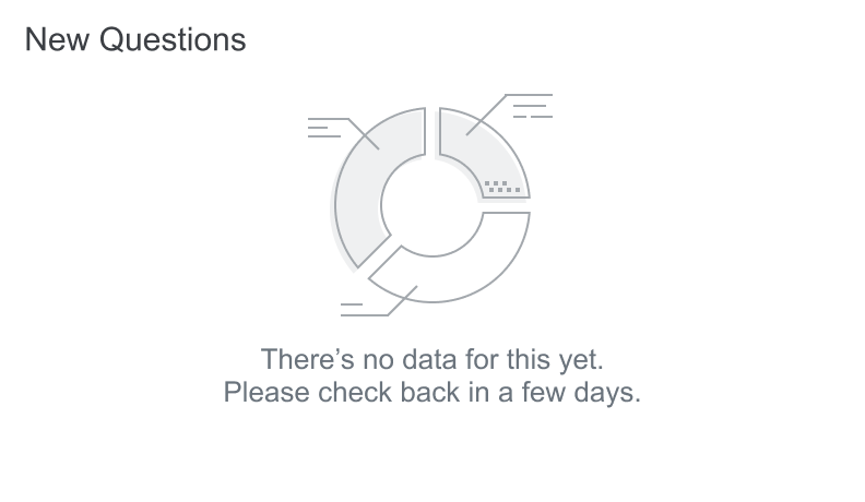
We’ve heard some interesting feedback. For instance, clients don’t remember to visit it every so often.
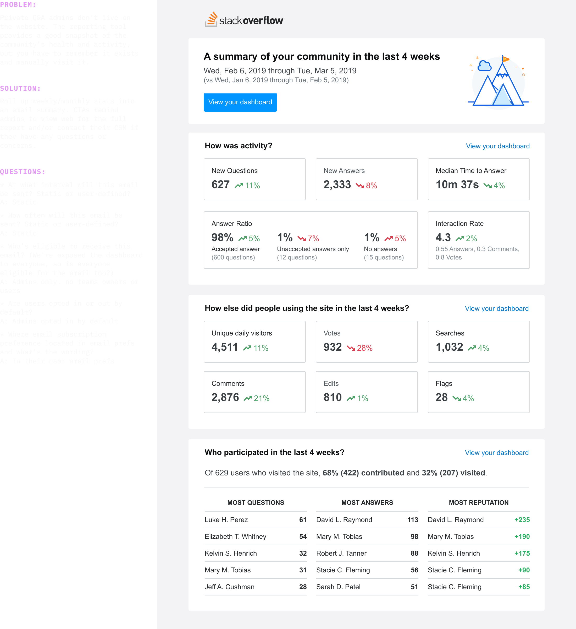
Another thing we’ve heard is the desire to share the dashboard with internal stakeholders (currently it’s only available to admins). After hearing this a few times, I created email digest. We're also considering app notifications and working with our integrations (like Slack and MS Teams) that would make the dashboard’s data more portable.
Overall we’ve seen our customer success team spending less time walking clients through their data because clients are able to understand it on their own. This dashboard is currently being used by every tier of our private Q&A product.
Following up some more
During one of our “cool down” periods, I reviewed what we shipped and compared it to our competitive teardowns and best practices. I saw a few opportunities for improvement that had a good chance of getting prioritzed.
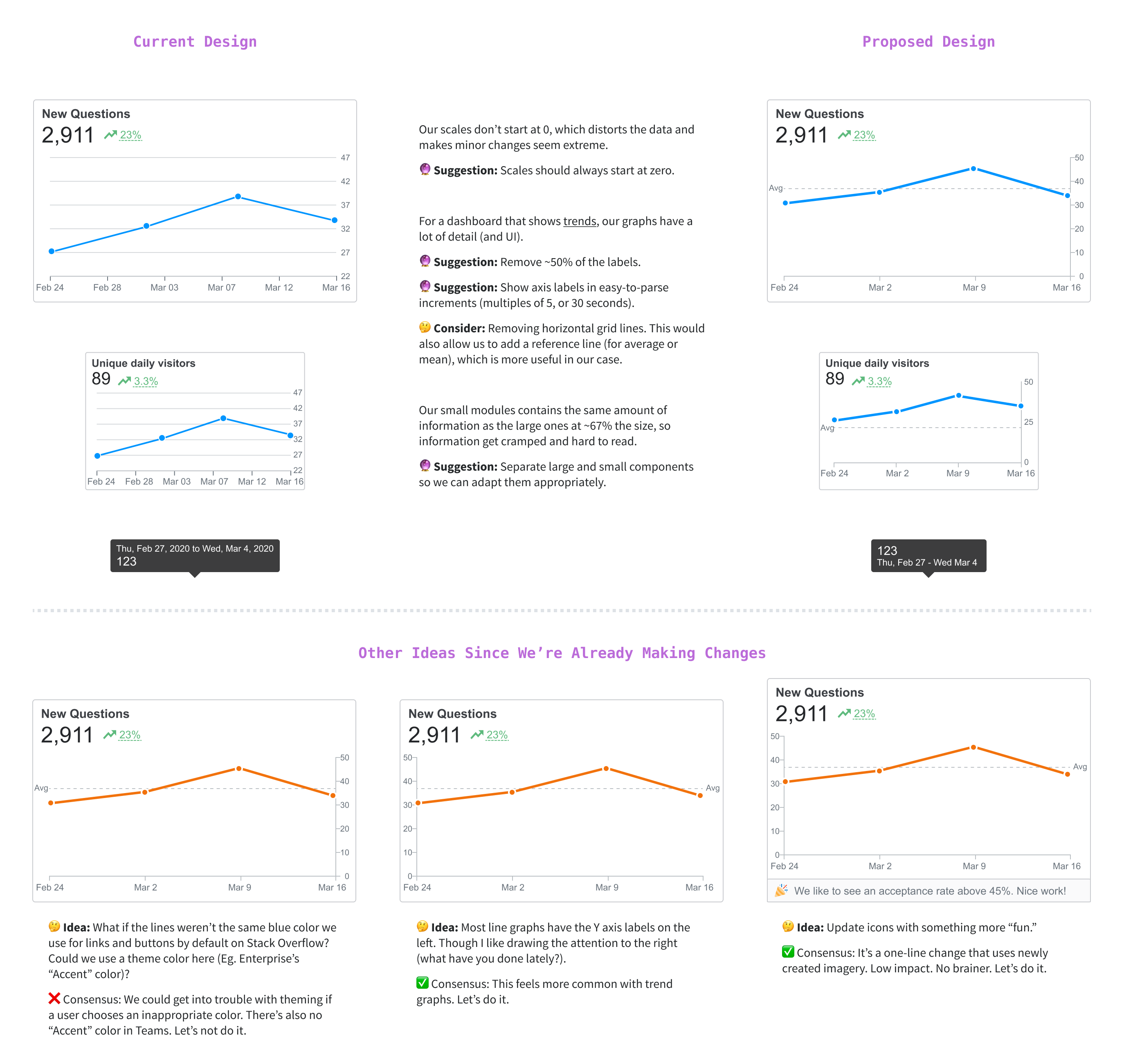
I organized my thoughts into a few screens (above) and scheduled a short meeting to pitch my ideas. I sold the group on most of my ideas and was pairing with an engineer in a pull request the next day.