Stack Overflow
How we approach design at Stack Overflow and a few notable projects.
I joined Stack Overflow in 2016 as a product designer on their Enterprise product. In addition to Enterprise, I’ve contributed to Documentation, Teams, our design system, and various email marketing projects.
Enterprise
Stack Overflow Enterprise is a private instance of Stack Overflow for organizations with large engineering teams. Stack Overflow for Enterprise is a private, secure version of Stack Overflow for large teams to ask and answer questions amongst themselves.

It’s the same Stack Overflow developers know and love, built for teams to privately share information within their team.
Stack Overflow Enterprise was Stack Overflow’s first private Q&A product and I was it’s first designer. I worked closely with product managers and engineers to create features that help clients manage and engage their community. I also worked with other product teams to ensure their work can be brought into the Enterprise product.
Theming
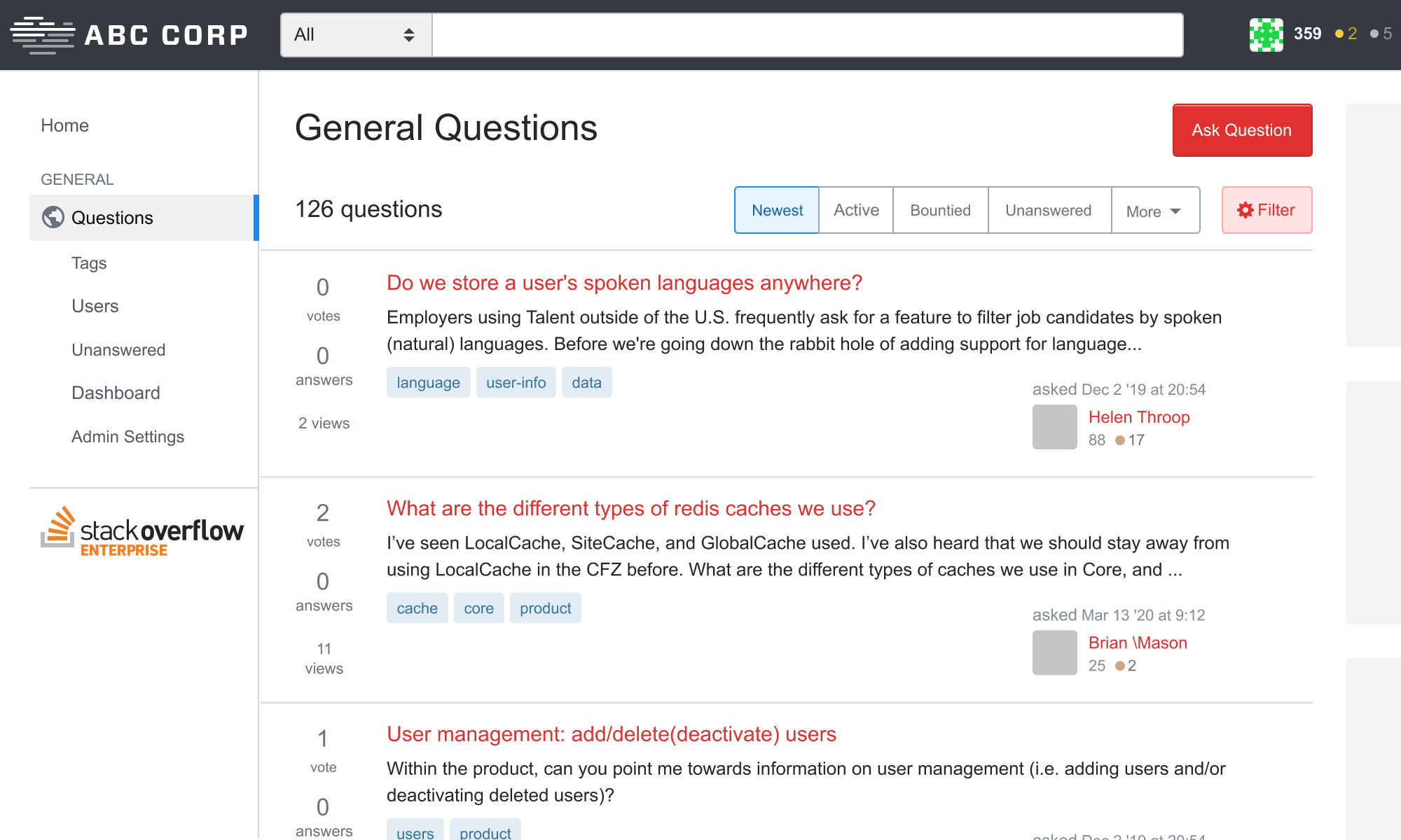
Data security and privacy are top concerns of Enterprise customers. In many cases, folks have their Enterprise site open in one tab and public Stack Overflow open in another. It’s important for folks to know where they are at a glance so they don’t post info in the wrong place. One way we tackle this is to make a branded theme for every client.
@import "less/_enterprise-base.less";
//  ======================================
//  User-defined variables
//  ======================================
@logo-width:            150px;
@logo-height:           30px;
@topbar-background:     @black-025;
@topbar-nav-color:      @black-900;
@link-color:            #2b00f7;
@accent-color:          #007733;
//  Overrides and customizations
@font-family:           -apple-system, BlinkMacSystemFont, Avenir, 'Segoe UI', Roboto, Helvetica, Arial, sans-serif;
I created Stack Overflow’s theming system into something we could scale for our enterprise clients. I refactored existing LESS variables so they could be overridden and removed lots of redundant CSS. The resulting LESS architecture allowed us to create new themes in as little as eight lines of code. Balpha have since evolved this system to include the entire Stack Exchange network, and I designed a UI that allows folks to create their own themes without writing any code.
Tag Watching
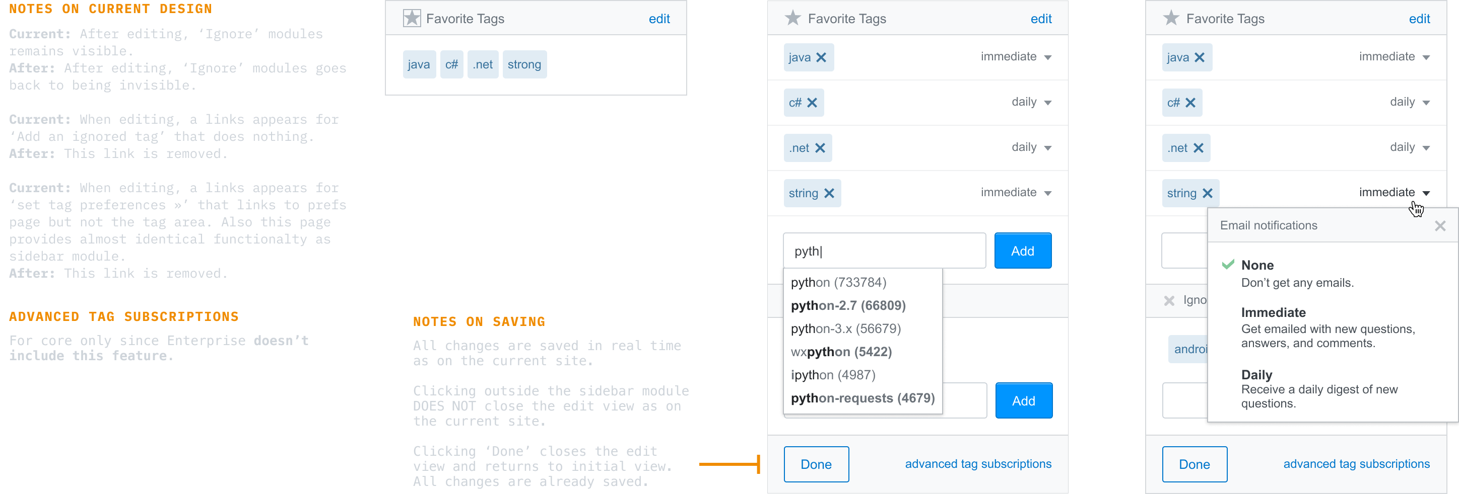
One way to personalize Stack Overflow is to watch tags. Watching tags weights questions in those tags more. These tags also appear as shortcuts in the sidebar and you can also receive an email digests of questions within those tags in varying frequency. We wanted to streamline the existing feature on public Stack Overflow for our Enterprise product.
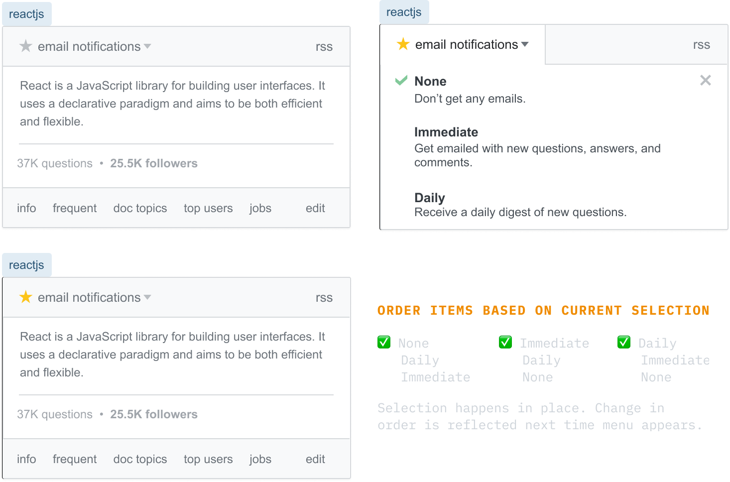
I prototyped, tested, and iterated a few designs, noting the small adjustments (such as copy tweaks) we’d want to make when adapting the feature for different product areas. We shipped this version, which was later improved by Pawel and Aaron to what’s on in the product today.
Documentation
While I focused on Enterprise, another team was working on a then in-beta product, Documentation. The design team was understaffed, so I joined the team and dedicated about ⅓ of my time to working on Documentation (with the remaining ⅔ spent with Enterprise).
I worked with our Product Creative Director on several explorations, including this personalized homepage.
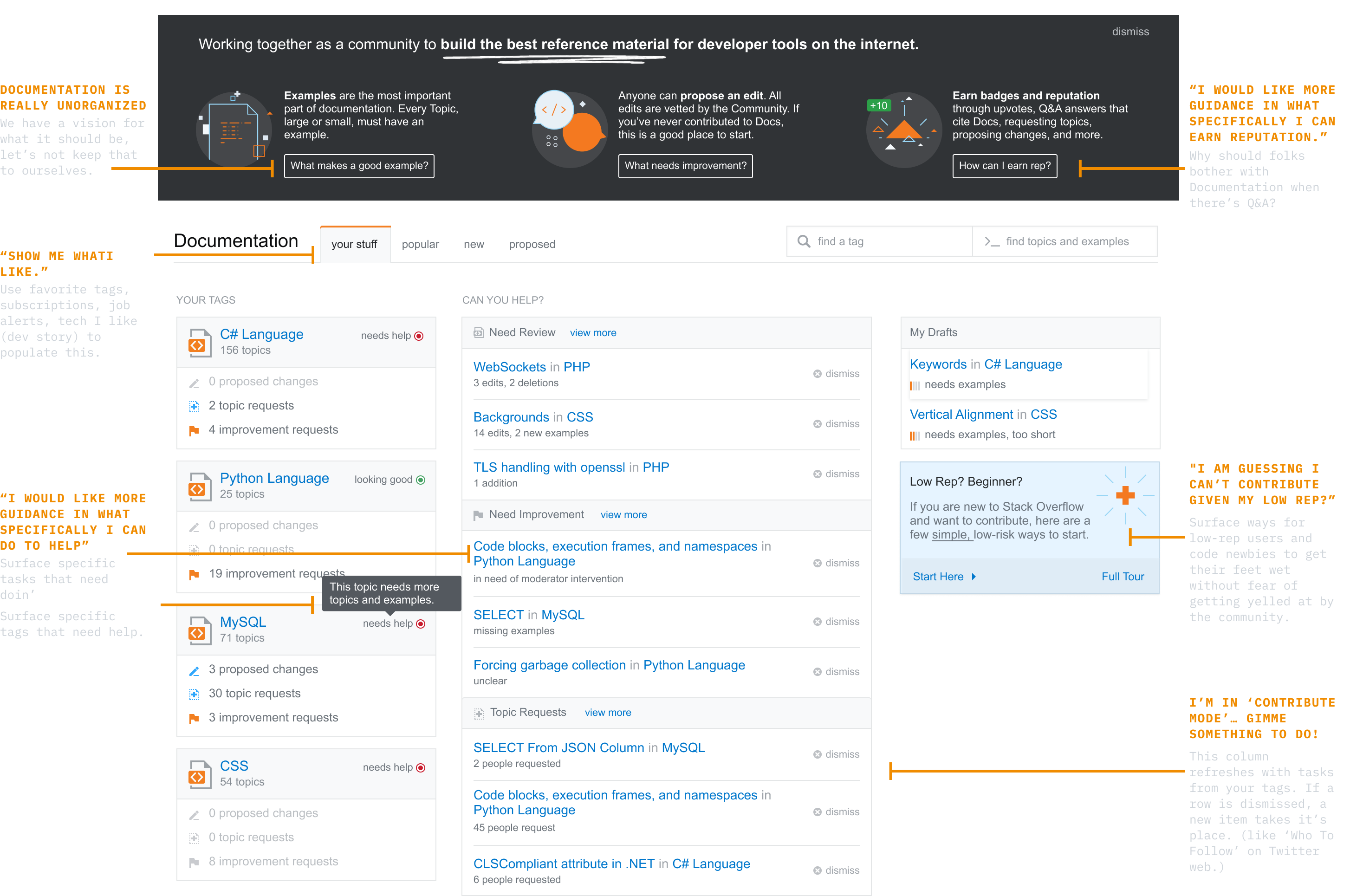
A few months after I started working on Documentation, the team was able to hire an additional designer to focus on Documentation, so I went back to Enterprise full-time.
Admin Settings
Stack Overflow Enterprise can be customized in a number of ways. We designed a suite of tools that allows organizations to manage their own instance however they see fit. Who can log in, who can see what, who can perform certain actions, that sorta thing.
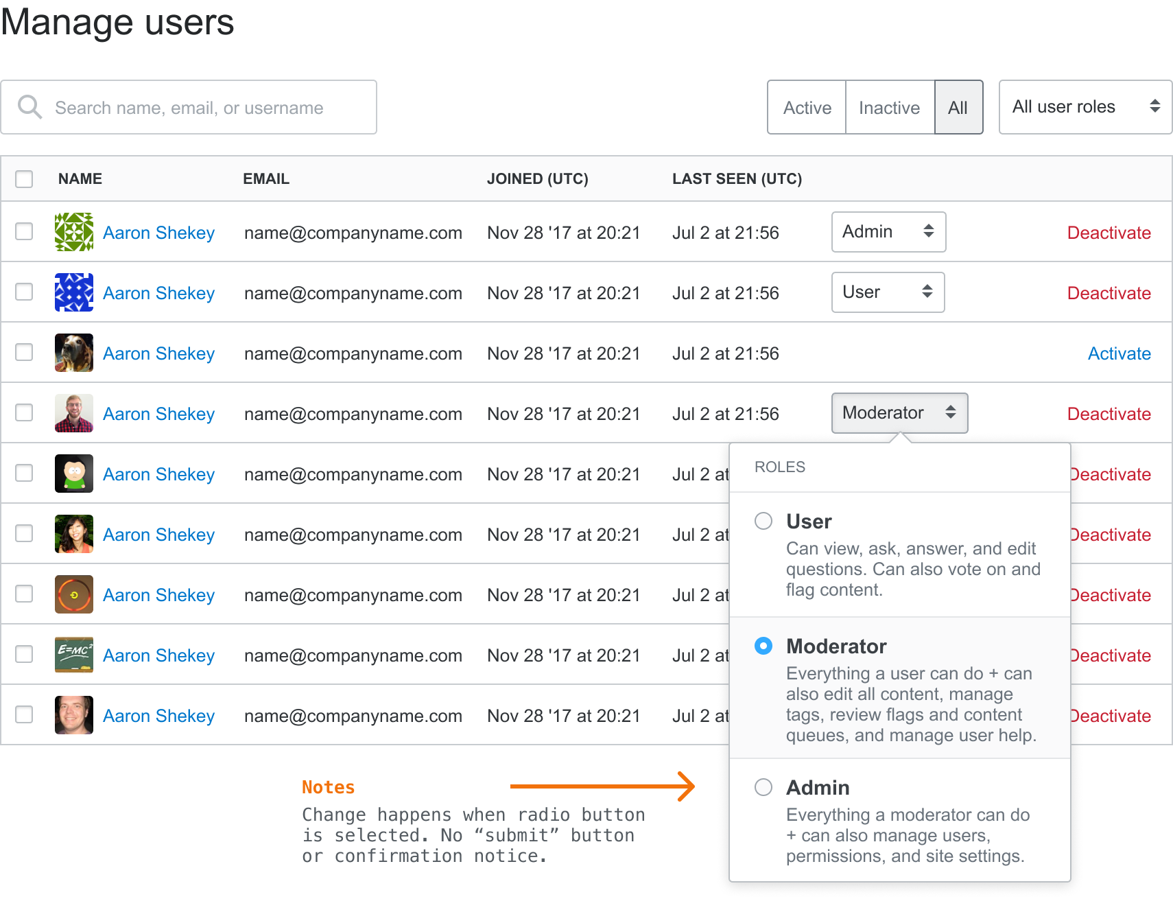
My team regularly speaks with our Enterprise clients about their workflows. Sometimes we ask open-ended questions, other times we watch them react to a prototype. I also work with our community management team to understand what makes a Stack Overflow community succeed (or fail). We use this research to set project appetite and guide design directions.
At one point when conducting research interviews, several clients mentioned that our settings weren’t organized well and some features were hard to find and understand.
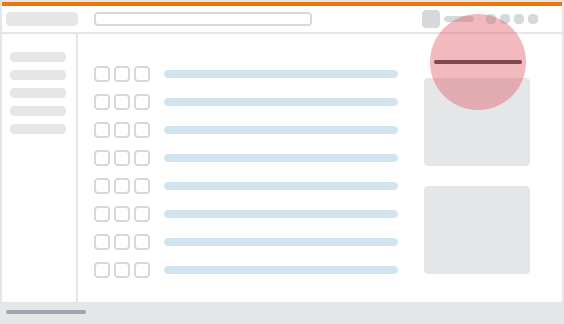
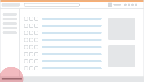
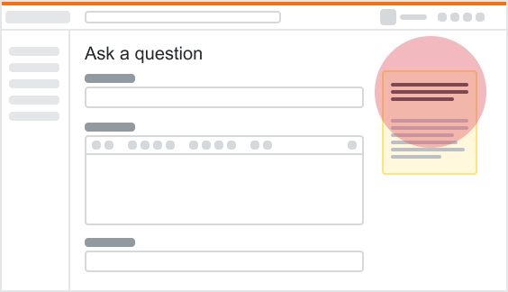
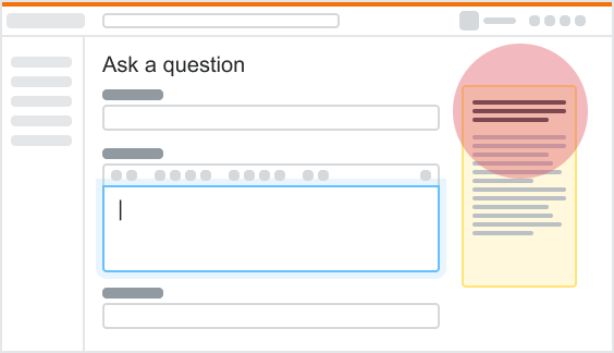
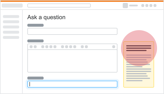
Hearing this, I pitched a redesign of our private Q&A settings, including an information architecture updates, an overhaul of each page's copy, and the addition of visual aides.
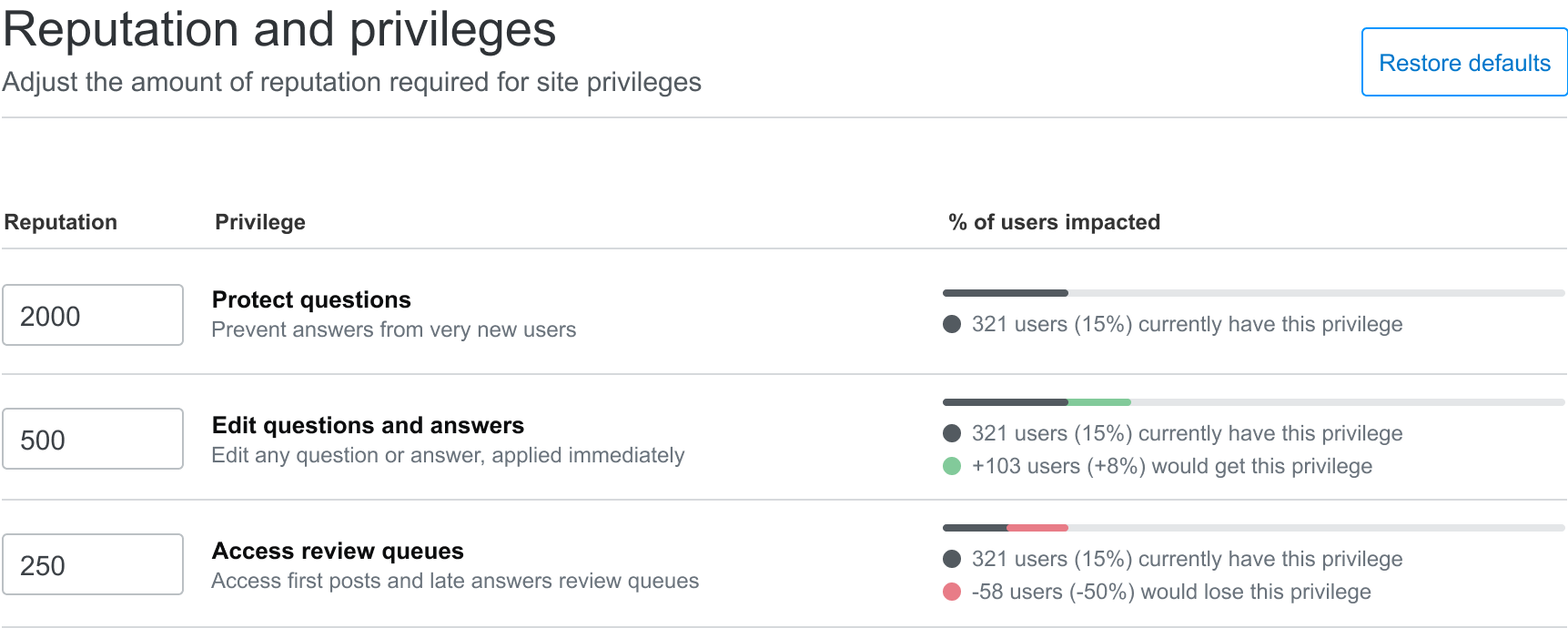
I worked with our customer success teams to identify the most used features, organized them using card sorting exercises, and created a flexible information structure that supports multiple private Q&A products, now and in the future.
Teams
In 2017, the Stack Overflow created a new tier of private Q&A product called Stack Overflow for Teams. It was a new product, so leadership gathered several folks from across the company to help with various efforts. I worked with Jin, Joshua, Pawel, Chance, Kit, and several others to explore the product UX.
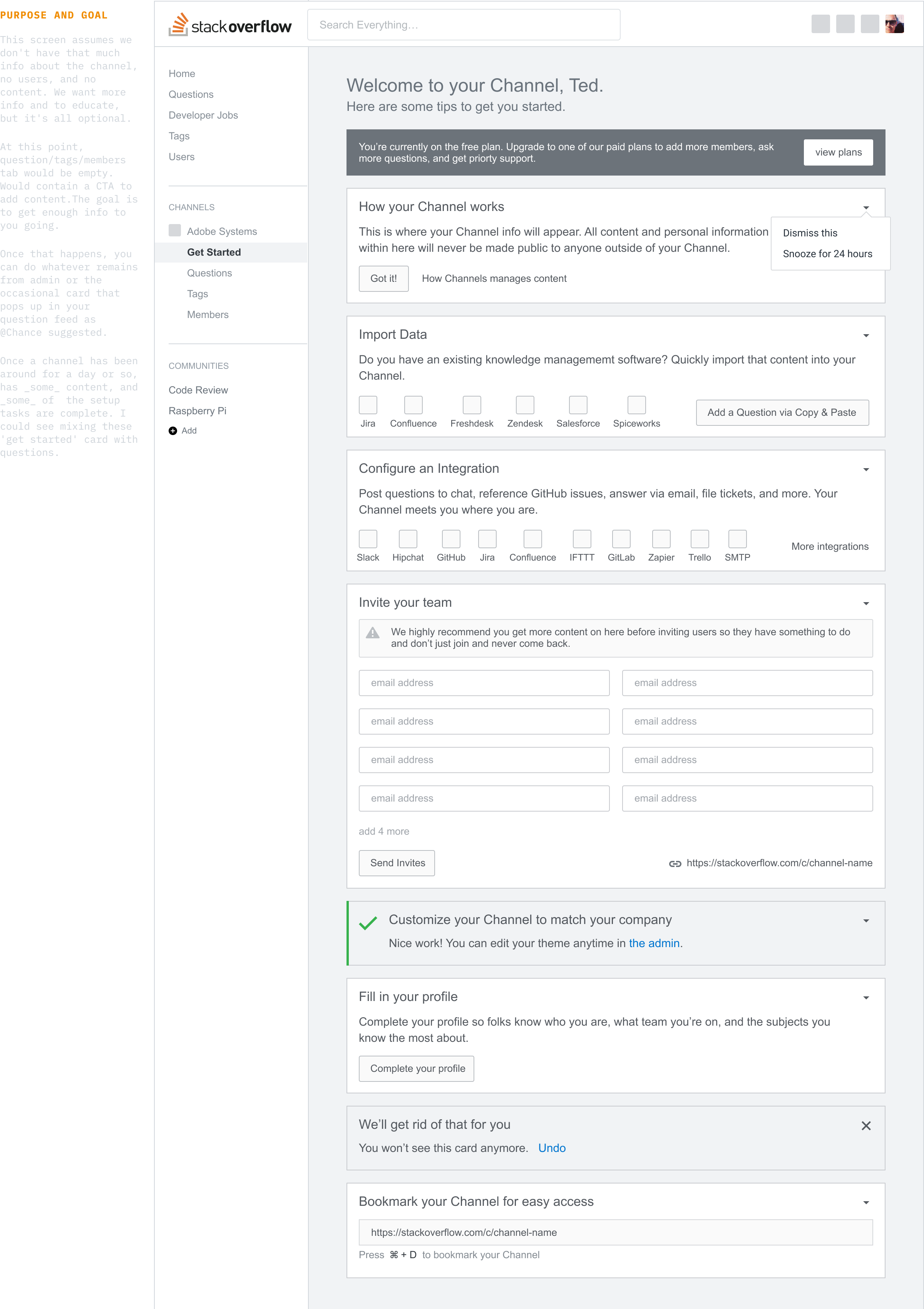
Stack Overflow assembled a tiger team of folks. Everyone focused on a different area, with each piece coming together at the end. One area I focused on was the empty state part of onboarding: what happens after you’ve completed the signup flow and and land in the product for the very first time. It was an extremely interesting project and also really challenging given the limited period of time we had for this work.
Email Marketing and UX
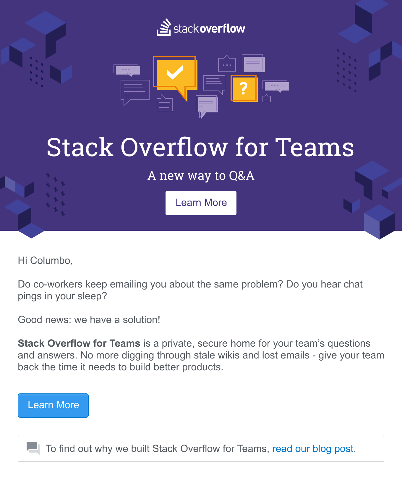
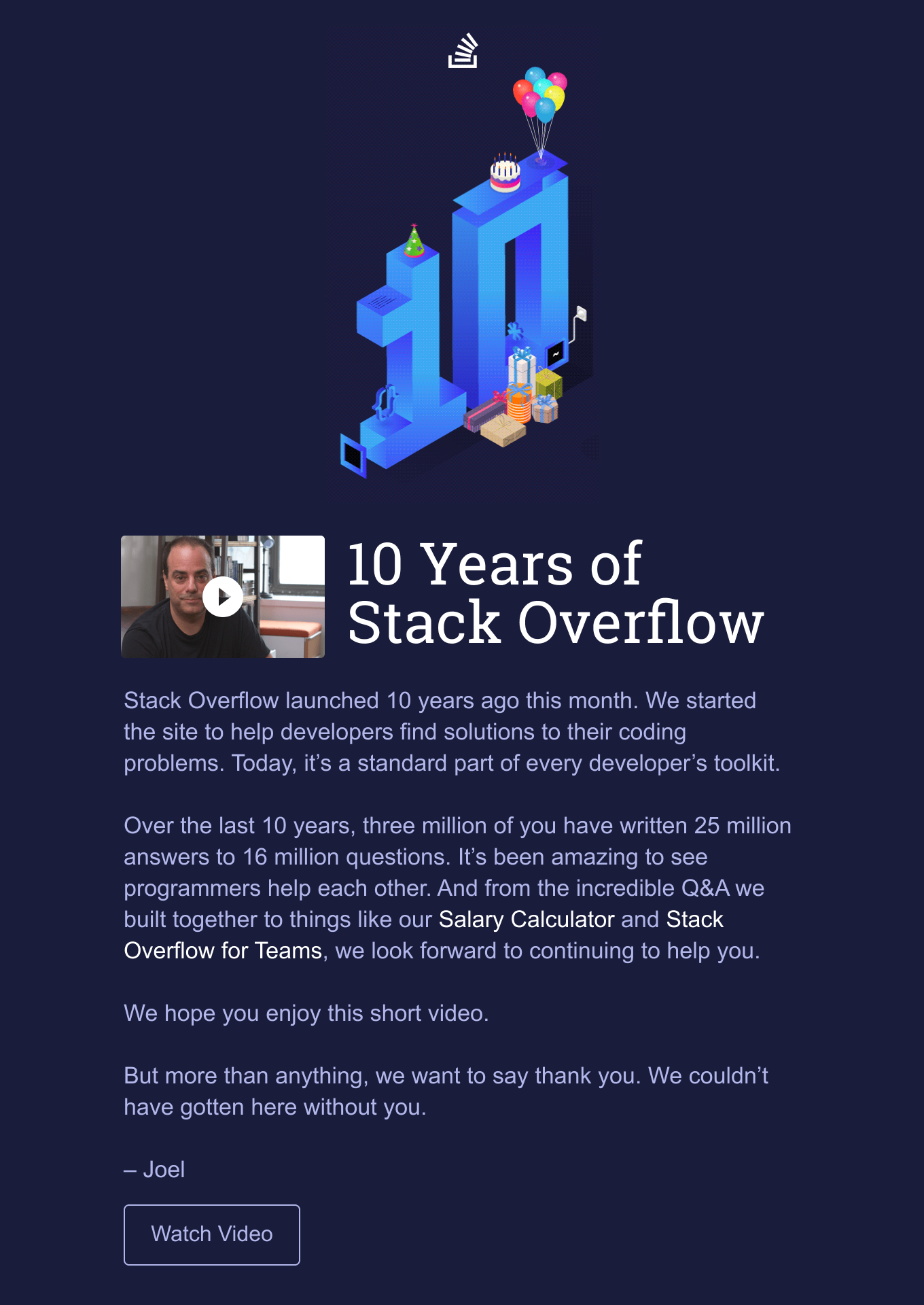
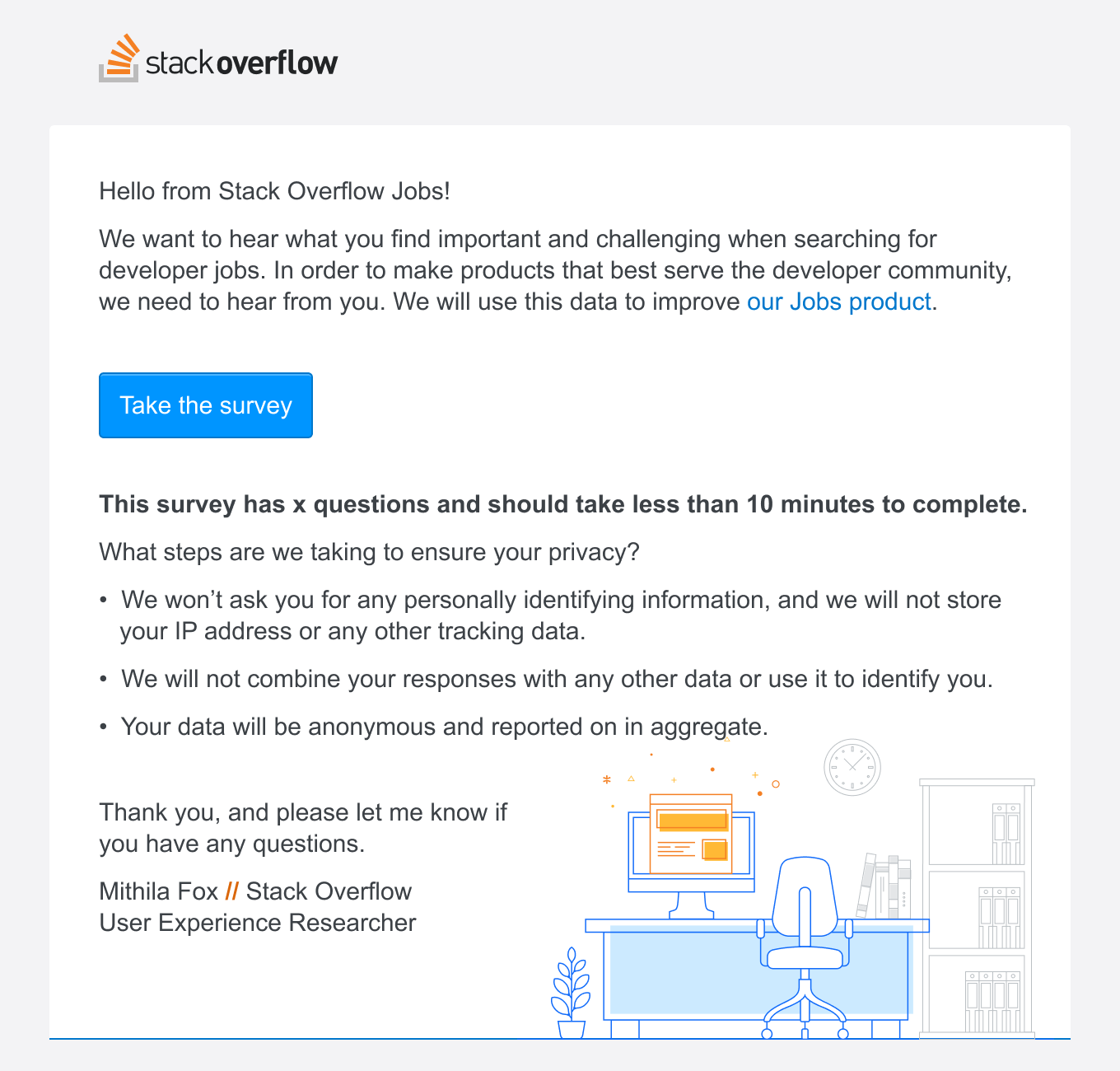
When I joined Stack Overflow, we didn’t send much email aside from a few messages sent to active Q&A users and basic things like resetting a password. Email templates were inconsistent and often broken in many places. I helped standardize our email design, fixed our rendering issues, and set us up to take some bigger swings with our email announcements.
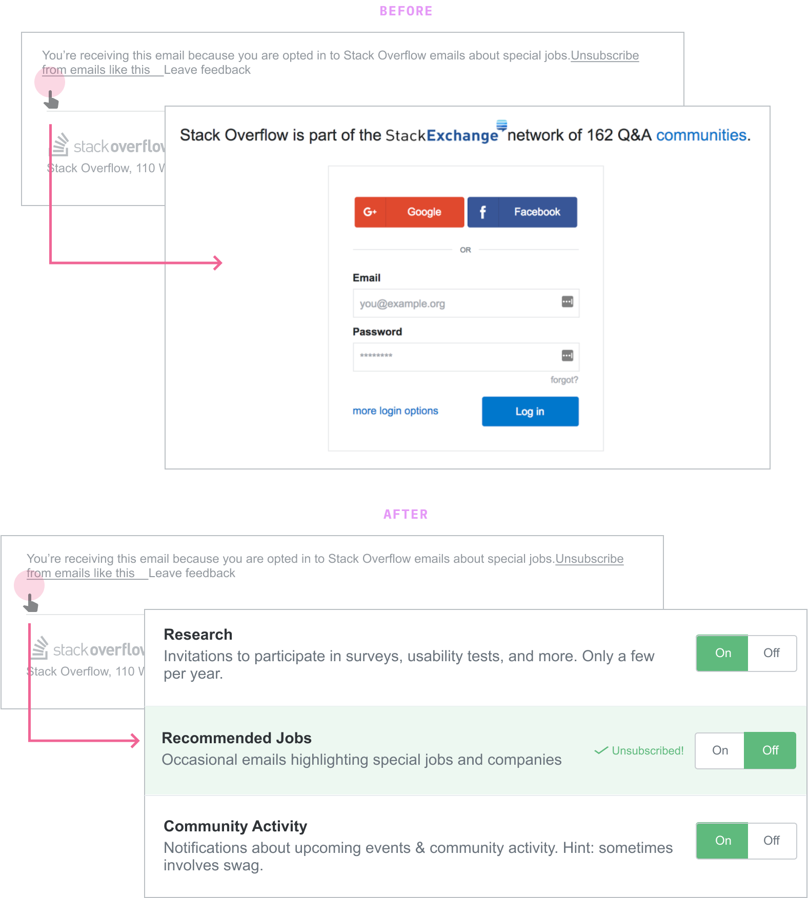
As our email program evolved and we started to send better-targeted emails, I helped redesign our email preference center to keep pace. My coworker and I wrote about our design goals and published a UX case study for this project.
I also initiated Stack Overflow’s email design system that empowers non-email-designers to build well-designed, consistently-rendered email without knowing all the ins-and-outs of email design.
Design system
Over several weeks, I documented a bunch of email knowledge I’d built up in my head over the years into Stack Overflow’s first email design system. I designed, coded, and wrote everything about how Stack Overflow builds email. I’ve written a few blog posts and given a few conference talks about our design system.
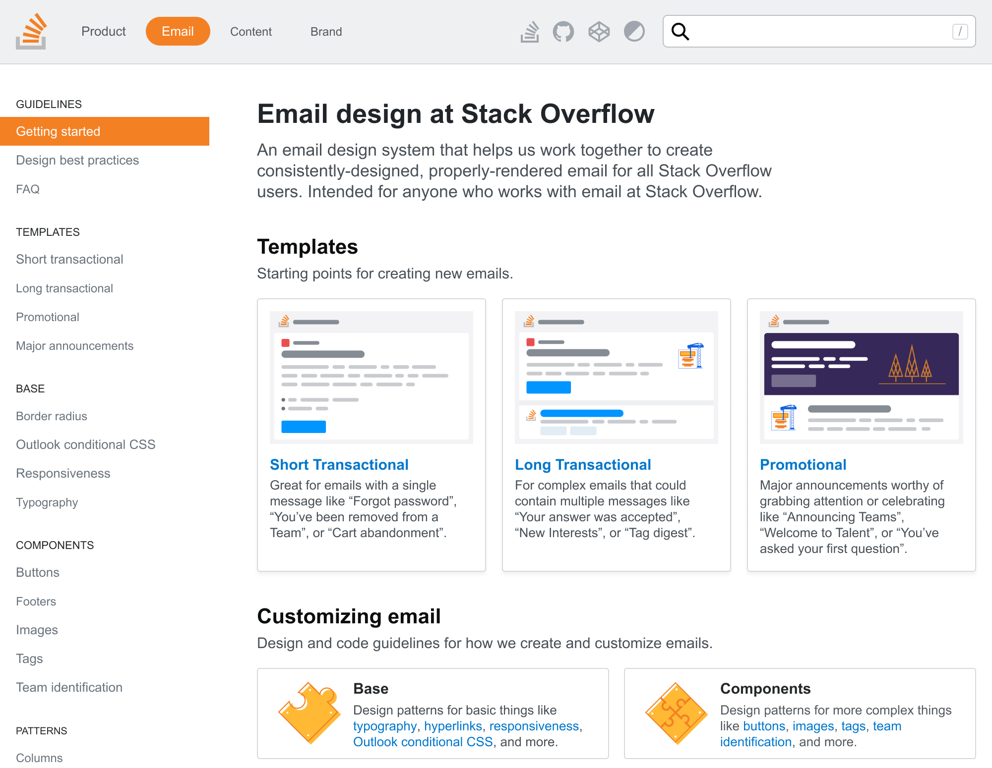
My design system work isn’t limited to email, though. I create components and documentation for tables and cards, as well as several sections for UX copy. I actively contribute to our design system, albeit sporadically.
Integrations
One way we’re focusing on product adoption and renewals of our private Q&A products is with integrations. We don’t expect our customers to spend all day on Stack Overflow, so we meet them where they already are.
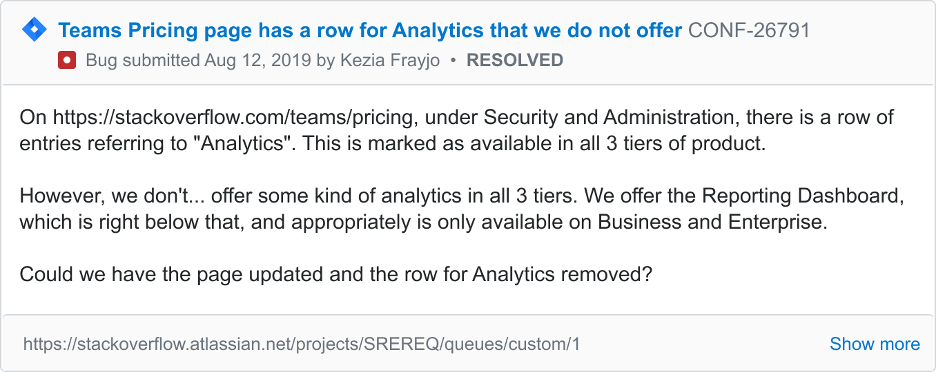
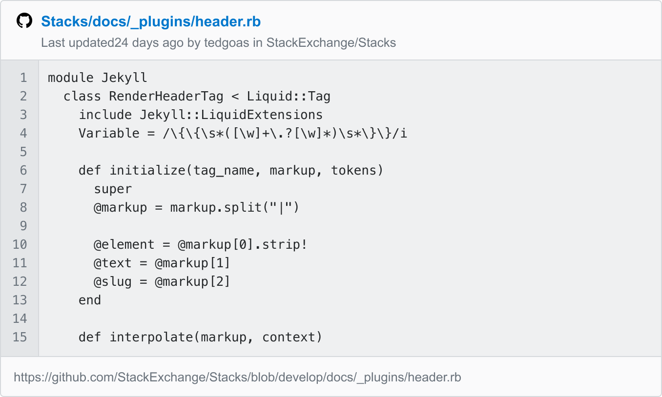
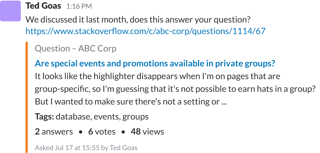
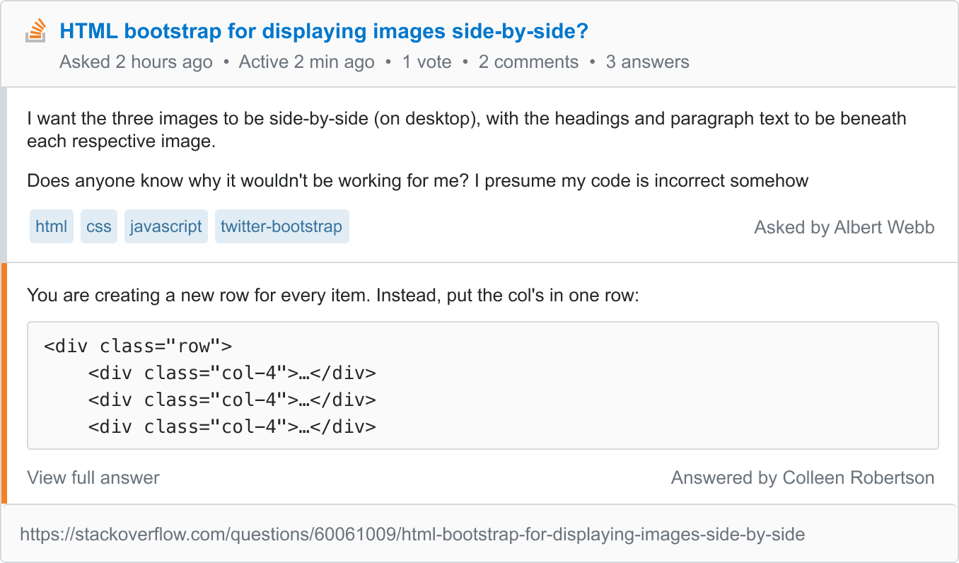
I worked across product teams to research, design, and test various integration visuals and workflows that support multiple integrations across all our product lines.
Experiments
Between projects, I’ve explored several product and feature ideas. Some got prioritized on the roadmap while others never saw the light of day. I’m proud of these self-initiated projects.
Voting from your email client
When speaking with SO for Teams users, some mention they’d like to improve their culture of voting. Eg. The team posts useful answers, but folks don’t upvote or accept the best ones to signal a high quality answer to the rest of the team.
This prototype explores what it would be like if you could vote on Stack Overflow questions right from your inbox.
Grammarly on Stack Overflow
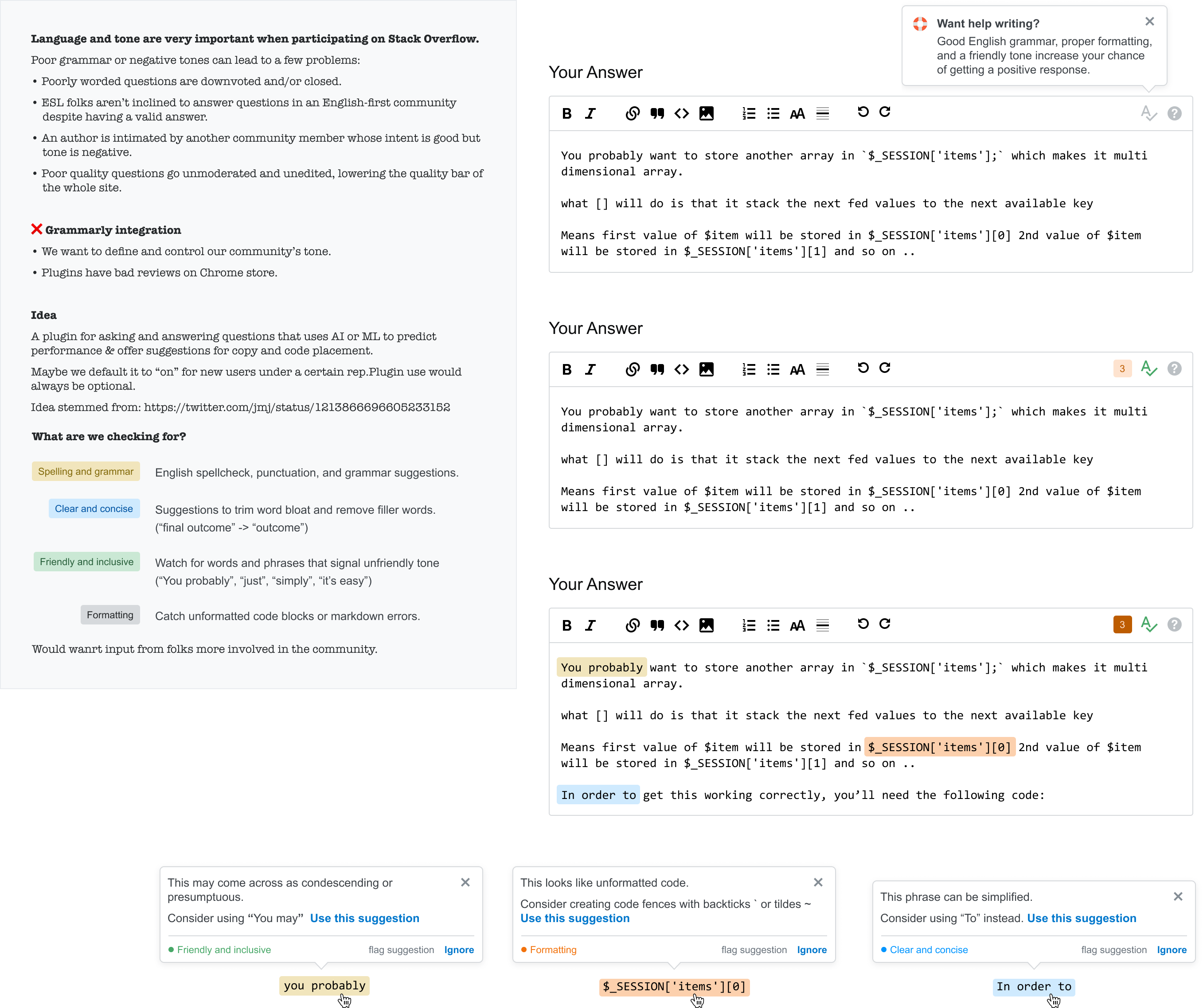
Language and tone are very important when participating on Stack Overflow. What if we could help users craft a high-quality question that’s likely to get a positive response?
Dark mode support in email
Developers love dark mode. The community mentions it often and our survey data backs that up. With a co-worker leading efforts to bring dark mode to the website, I explored what it would take to bring dark mode to email.
